Key Takeaways
- If your homepage doesn’t make sense in 3 seconds, it’s not working. Users (and AI) need instant clarity — not cleverness.
- Your hero section should answer three questions fast: What is this? Is it for me? What should I do next?
- Design should guide, not decorate. Use visual hierarchy, clear CTAs, and no-nonsense language to drive action.
- Brutal clarity isn’t boring — it’s what converts. Cut jargon, remove distractions, and say what you mean, right away.
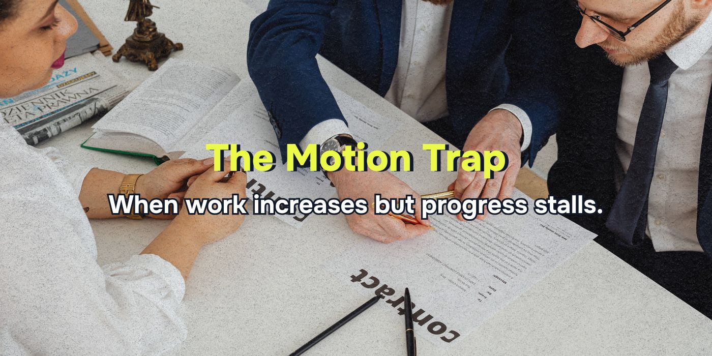
Most websites are trying to impress. The smart ones are trying to guide.
Because on the internet, your real competition isn’t another brand — it’s confusion.
If someone lands on your homepage and can’t figure out what you do, who it’s for, and what they should do next in under three seconds… they won’t figure it out at all. They’ll leave.
The solution? Brutal clarity.
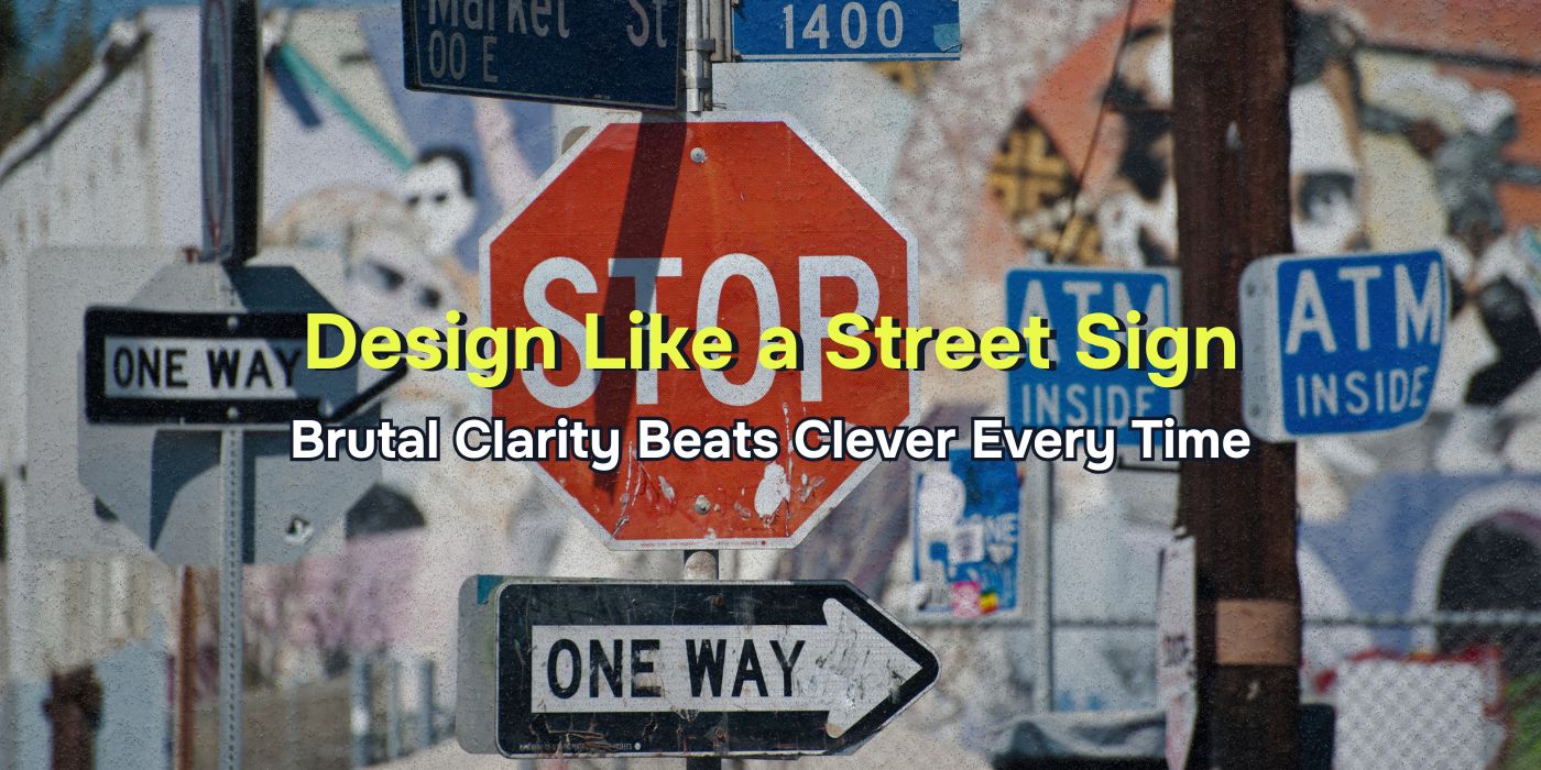
That means designing and writing your site like a street sign: fast, simple, unmistakable. Here’s exactly how to do it — and what most marketers overlook.
What Brutal Clarity Really Means
Brutal clarity isn’t about stripping personality from your brand. It’s about removing the friction between your visitor and the action they came to take.
Think about a stop sign:
- One color
- One word
- One message
And yet no one misses it. Even at 40 mph.
Your homepage, your hero section, your landing pages — they’re stop signs, not posters. If they’re not immediately useful, they’re ignored.
The 3 Questions Your Page Must Answer in 3 Seconds
Every page, especially your homepage, should answer these within seconds of loading:
- What is this business?
- Is it for me?
- What should I do next?
If a stranger can’t answer all three by looking at just the top section of your page, you’re losing leads.
Step-by-Step Fixes for Brutal Clarity
Here’s how to improve your homepage clarity in less than an hour.
1. Rewrite Your Headline to Be Literal, Not Clever
Most websites bury their value in vague taglines or branding fluff.
- Unclear:“Empowering Possibility Through Innovation”
- Clear: “Affordable Roof Repair and Replacement in Tampa, FL”
Ask yourself: If your headline were on a billboard, would a driver at 60mph know what you sell?
2. Add a Subheadline That Speaks to Results
Your subheadline should explain what outcome the visitor gets from working with you — not just what you offer.
- Instead of: “We offer residential and commercial landscaping”
- Try: “Keep your lawn green, clean, and weed-free — without lifting a finger.”
This connects your service to something your customer actually wants.
3. Use One, Specific Call to Action — and Repeat It
“Learn More” doesn’t cut it. Your CTA should be action-oriented and tell the user exactly what they’re getting.
- Weak CTA: “Get Started”
- Better CTA: “Request a
- Free Lawn Care Quote”
- Best CTA: “Get a Free Lawn Care Quote — Response in 24 Hours”
Repeat your CTA in three places:
- Above the fold
- Mid-page
- At the bottom
Make it easy, obvious, and frictionless to act.
4. Replace Jargon With Real Language
If your copy sounds like something no one says out loud, rewrite it.
- Bad: “We deliver scalable digital solutions for growth-minded organizations.”
- Better: “We build websites that get more leads for small businesses.”
Real people want plain talk. So do search engines and AI tools.
5. Use Visual Hierarchy to Direct Attention
Don’t let your layout compete with your message. The most important thing should be the most prominent thing.
How to fix it:
- One headline. Big and bold.
- Supporting subheadline with a clear benefit.
- One CTA button in a contrasting color.
Remove carousels, autoplay videos, or anything slowing down understanding.
If you had to squint at your homepage from 5 feet away, would you still know what to do?
6. Bring Key Info Above the Fold
Don’t bury the lead five scrolls down.
Above the fold, your page should show:
- What you do
- Who you help
- Where you’re located (if local)
- A next step (CTA)
- Optional: A trust signal (like “Rated 5 Stars on Google”)
Everything else can come later. The top section is about orientation and momentum.
7. Add Immediate Social Proof
You don’t need a full testimonial block — you just need one line that builds trust fast.
Examples:
- “Trusted by 1,200 Tampa homeowners”
- “Voted Best Lawn Care Company in Cumming, GA”
- “Backed by 400+ 5-Star Reviews”
Put this near your headline or CTA. Let users know they’re not your first rodeo.
8. Structure Your Page Like a Guided Tour
Your headings should walk the visitor through your story — even if they only skim.
Good homepage H2s:
- “Why Homeowners Choose Our Roof Repair Team”
- “What’s Included in Our Lawn Maintenance Plans”
- “How to Book Your Free Estimate Today”
Your layout and copy should reduce uncertainty — not introduce more options.
Bonus: Things Marketers Often Forget
Button copy matters. “Contact us” is a black hole. Tell people what happens when they click.
No one reads paragraphs. Use bullets, bolding, and spacing to increase comprehension.
Creative ≠ effective. Clever messaging feels good — clear messaging performs better.
Load time is part of clarity. If your hero section takes 4 seconds to show up, you’ve already lost the user.
Final Thought
Brutal clarity doesn’t mean ugly. It means unmissable.
Your site shouldn’t require interpretation. It should work like a street sign: instant, intuitive, and clear. Because online, people don’t slow down. If they can’t tell what to do, they’ll do nothing.
Want more conversions? Fewer bounces? Better leads?
Stop decorating. Start directing.
Design like a street sign.
FAQs
Can I still use creative branding or design?
Yes — just don’t lead with it. Use creativity to support a clear message, not to replace one.
What’s the biggest clarity killer on most websites?
Vague headlines and generic CTAs. If your homepage opens with “Innovating the Future,” no one knows what you do.
How do I test if my homepage is clear enough?
Show it to someone unfamiliar with your business for 5 seconds. Ask them: What do we do? Who is it for? What’s the next step? If they can’t answer all three, rewrite it.