Key Takeaways
- Too many options create friction—not conversions.
- Clear, guided navigation beats content overload every time.
- Each page should have one job, one CTA, one decision.
- Website design is about pacing the journey—not dumping the menu.
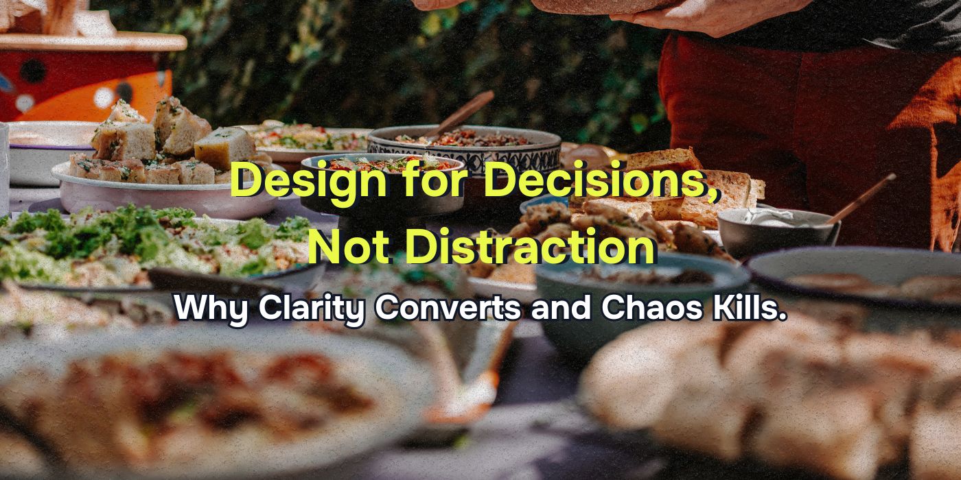
Most websites are built like buffets: a chaotic sprawl of options, all piled together with the assumption that more choice = better experience.
But the best-performing websites? They operate more like a deli counter. Focused. Directed. Built to serve the right thing to the right person, fast. And more importantly—they create fewer distractions between the moment of interest and the moment of conversion.
What’s Wrong With Buffet Websites?
Buffet-style sites dump every service, case study, and blog post into the mix and hope something sticks. The result is cognitive overload. No clear path. No priority. And absolutely no strategic control over what the visitor sees or does.
Instead of guiding the user journey, you’re giving the user a cafeteria tray and letting them fend for themselves. It might feel “comprehensive,” but from a UX and conversion perspective, it’s just chaos in a nice template.
Too many CTAs. Too much internal jargon. Too many options without a clear next step. That’s how users bounce—not because they didn’t like what they saw, but because they didn’t know what to do next.
The Deli Counter Approach: Curated, Not Crowded
Think about how a deli counter works. There’s an order to things. A customer comes in with a goal—maybe they know exactly what they want, or maybe they need help deciding. Either way, someone guides them. Options are presented with context. There’s pacing. There’s control.
Your website should feel the same way.
- One CTA per page, not five.
- Navigation that follows buyer logic, not your org chart.
- Content that meets people where they are in the decision cycle.
- Layout that steers attention—not competes for it.
The best deli counters don’t offer you everything. They offer you what matters next. That’s what your site should do.
What This Looks Like in Practice
This doesn’t mean stripping your site to bare bones. It means prioritizing context and decision paths over sheer content volume.
- A homepage that focuses on the core value proposition and just 2–3 high-intent paths—not a laundry list of services.
- Service pages that don’t just pitch—they explain pain points, guide diagnosis, and set up logical next steps.
- Case studies organized by use case or buyer type, not by internal categories.
- A single hero message per page, with a supporting CTA that matches the reader’s stage in the journey.
And it’s not just visual design—it’s the thinking behind it. Each section should answer one specific question: What does this person need to know to take the next step with us?
Final Thought
You don’t walk into a deli and get overwhelmed. You walk in, someone nods, and you’re out the door five minutes later with exactly what you needed.
That’s what your website should do. Not impress with volume. But convert through clarity.
So if your site’s trying to be everything to everyone, ask yourself: is it a buffet… or a counter?
Because the businesses that win in digital? They serve. They guide. They don’t just put out food and hope you fill your plate.
Less buffet. More counter.
FAQs
Isn’t offering more information helpful for buyers?
Not if it overwhelms them. Users need clarity, not clutter. Prioritize what’s most relevant for their next step.
How do I know if my site is too much like a buffet?
Look at bounce rates, CTA clicks, and user flow. If visitors don’t follow a clear path, they’re likely getting lost or distracted.
Can I still show all our services on the site?
Yes—but not all at once. Use smart architecture and internal links to let users discover deeper layers only when they’re ready.