Key Takeaways
- Clarity beats creativity. Say exactly what you do, who it’s for, and where — in plain English, right at the top.
- Your homepage should focus on outcomes, not offerings. Don’t list services. Show the results those services deliver.
- Social proof belongs above the fold. If you’ve earned trust, lead with it — not 5 scrolls down.
- CTAs should be clear, repeated, and tied to real next steps. “Contact us” isn’t enough. Tell them what happens next and why it matters.
The high-leverage fixes most marketers overlook.
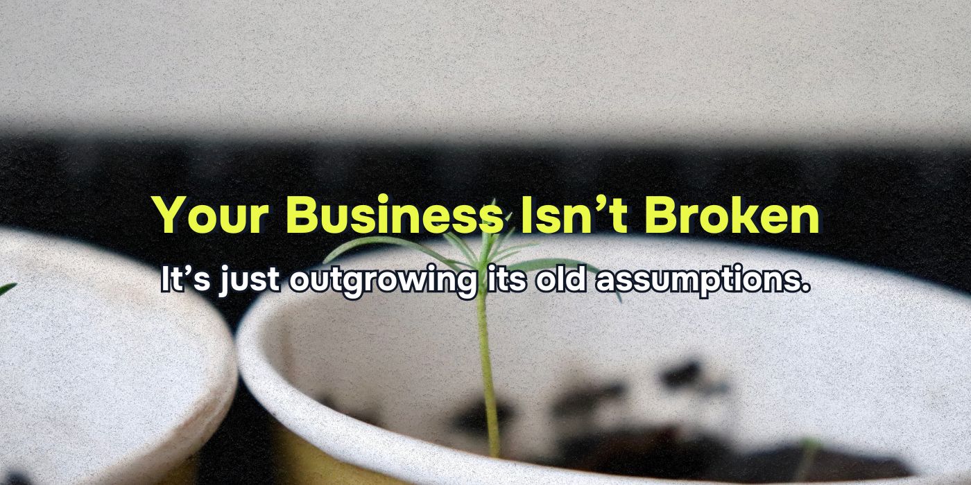
Let’s be honest: most homepages look decent and convert terribly. It’s not that they’re broken — they’re just bland. They say a lot without meaning much. They’re designed to impress, not convert. And they confuse both humans and machines.
I’ve looked at hundreds of homepages across industries. If you gave me yours and a 20-minute timer, here’s exactly what I’d do — and it’s probably not what you think.
1. Rewrite Your Headline to Say What You Actually Do
You’d be shocked how many homepages don’t clearly state what the company offers. If your headline doesn’t tell me — in 10 words or less — what you do, who it’s for, and where you do it (if relevant), we’re starting over.
How to Fix It
- Change “Empowering Businesses Through Innovation” to:
- “Managed IT Services for Small Businesses in Chicago”
That’s the difference between getting featured in Google’s generative box — and getting skipped entirely.
2. Cut Fluff, Add Outcomes
Your customer doesn’t care how long you’ve been in business until they understand what you’ll do for them.
How to Fix It
Rewrite anything that starts with “We offer…” or “We provide…” to instead say what the customer gets.
- Instead of “We provide residential landscaping,” say:
- “Enjoy a lush, low-maintenance lawn you don’t have to think about.”
This instantly shifts the page from “here’s our stuff” to “here’s your result.”
3. Fix Your CTA Language and Placement
If your call to action says “Get Started” or “Learn More,” it’s a placeholder — not a conversion driver.
How to Fix It
Make your CTA concrete and tied to the next step. Bonus points if it includes a benefit.
- Bad: “Contact Us”
- Better: “Request a Free Quote in Tampa”
- Best: “Book Your Free Roof Inspection — Available This Week”
Also: repeat it. Once above the fold. Once in the middle. Once at the bottom. Don’t make users (or search engines) hunt for the next step.
4. Swap Out Jargon for Real Words
Marketers love phrases like “scalable solutions,” “tailored strategies,” and “customer-centric experiences.” None of those mean anything to your reader.
How to Fix It
Read your hero section out loud. If you wouldn’t say it to a friend, rewrite it.
- Replace “end-to-end digital transformation” with:
- “We help brick-and-mortar businesses grow online through web design, SEO, and paid ads.”
The clearer your copy, the stronger your results — and the easier it is for AI to understand what you offer.
5. Add Social Proof Above the Fold
Most homepages hide their proof. Reviews are five scrolls down. Logos are buried in a carousel. Case studies are in a dropdown menu no one clicks.
How to Fix It
Add one of these near the top of the page:
- A review with a name and photo
- A stat: “Over 900 5-star reviews”
- A badge: “Voted Best Roofing Company in Tampa, 2024”
- A simple logo stack: “Trusted by brands like X, Y, and Z”
Why? Because both humans and algorithms trust what other people say more than what you say.
6. Make Your H2s Work as a Mini Sitemap
Your subheadings aren’t just dividers — they’re a signal. To users and search engines.
How to Fix It
Use H2s that reflect what users are actually looking for. For example:
- “Why Tampa Homeowners Trust Our Roofing Services”
- “What’s Included in Our Lawn Care Packages”
- “How to Get a Free Same-Day Quote”
Every H2 should answer a real question or reflect a real intent — not just say “About” or “Services.”
7. Clarify Who It’s For (and Who It’s Not)
Your homepage should make it crystal clear who your offer is built for. Too many pages try to speak to everyone and end up resonating with no one.
How to Fix It
Add a line like:
“Perfect for busy homeowners who want a low-maintenance lawn without breaking the bank.”
That tells your reader they’re in the right place — and helps filter out tire-kickers and bad-fit leads.
8. Inject Location Data — Naturally and Often
Especially for service-area businesses, most sites mention the location once and call it a day. Google’s AI wants reinforcement.
How to Fix It
Naturally mention your city or region in your H1, intro, testimonials, CTA, and service descriptions. No keyword stuffing — just plain, clear relevance.
- “Serving families in Gainesville, FL since 2008”
- “Need a roof repair in Gainesville? We’re available 7 days a week.”
This increases your local search visibility and AI inclusion.
9. Add One Strong FAQ Section (Don’t Overthink It)
FAQ sections are ranking gold. They answer questions directly, use schema well, and help convert users who just need one more piece of info.
How to Fix It
Pick 3–5 real questions customers ask and answer them in plain English. Example:
- Do you offer financing for roof replacements? Yes — we work with a local lender to provide flexible, affordable payment options. Most approvals happen within 24 hours.
This is simple, high-value content that humans love and Google trusts.
10. Remove Anything That Doesn’t Drive Action or Build Trust
If a section isn’t clarifying your offer, proving your credibility, or prompting action — cut it.
- Empty taglines
- Stock photos with no relevance
- Blocks of text no one reads
- Awards from 2014
- Auto-play videos that don’t load
Your homepage should work like a sales rep. If it’s not doing the job, it’s noise.
Final Thought
You don’t need a full redesign. You don’t need a $20k agency. You just need 20 minutes, a fresh pair of eyes, and the discipline to stop saying what you want to say — and start showing what your customer needs to hear.
Clarity. Outcomes. Trust. Direction.
That’s what turns a homepage from a brochure into a growth engine.
FAQs
How often should I update my homepage content?
At least quarterly. Refresh stats, swap in new reviews, and make sure your messaging still matches what your ideal customer actually wants.
Can I still use creative branding language?
Sure — just don’t lead with it. Clarity comes first. Use creativity to support, not replace, your core message.
What’s the ideal length for a homepage?
Long enough to answer key questions, build trust, and guide action — but short enough that every section earns its place. Most underperforming homepages aren’t too short — they’re too unfocused.